In this tutorial, we will walk through how to use Smart Report Maker (SRM) to create a time series chart that tracks sales performance over the last six months. We will use the default connection and test tables available in SRM to build this chart.
Note: Test tables are added in the default database for demo purposes, allowing you to explore Smart Report Maker features without needing a custom dataset.
Chart Setup: Sales Performance (Last 6 Months)
- Access the Chart Management Panel
- Open Smart Report Maker and click Charts from the side panel.
- Click Add New Chart to launch the chart builder wizard.
Step 1: Appearance Step
- Select Chart Type:
- Choose Time Series as your chart type. We select this because our X-axis will contain dates (OrderDate), and we need to display trends over time. A Time Series chart makes it easy to spot fluctuations in sales performance across different months.
- Choose Time Series as your chart type. We select this because our X-axis will contain dates (OrderDate), and we need to display trends over time. A Time Series chart makes it easy to spot fluctuations in sales performance across different months.
- Choose Widget Size:
- We’ll select Full Page Width so that the chart has more space on the dashboard, making it easier to analyze at a glance. This also ensures all the data points are visible without cluttering the chart.
Step 2: Settings Step
- Chart Name: We use the internal name “Sales Performance”. This name will help us quickly identify the chart later when adding it to a dashboard.
- Chart Title: We use the title “Sales Performance (Last 6 Months)” to clearly convey what the chart represents. This title will appear on the chart itself, making it easy for viewers to understand its purpose.
- Category: We can assign a category for easy filtering.
- Data Connection: Select “Data Connection” (the default connection). This tells the system where to pull the data from—our MySQL test database in this case.
- Chart Security: Set the chart as Public. This allows anyone to view the chart, even without logging in. Making the chart public is useful when you want to share insights openly, such as on a company website or in a public report.
- Link chart to a Summary Table: We enable the summary table to link the chart with a detailed report. This option allows users to access both the visual representation and the underlying data behind the chart by clicking “Display” on the chart widget.
Step 3: Data Step
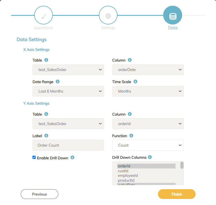
This is where we define the data source and structure of the chart. We’ll configure the X-axis and Y-axis based on the test table test_SalesOrder.
X-Axis Configuration
- Select Table:
Choose the tabletest_SalesOrderbecause it contains order-related data, which is ideal for tracking sales. - Select Column:
We chooseOrderDateas the column for the X-axis since it contains the dates when orders were placed. This will allow us to see how sales have fluctuated over the past six months. - Time Range:
Set the time range to Last 6 Months so the chart only shows data for the most recent half-year. This helps us focus on recent trends, which are often the most relevant for decision-making. - Scale:
Choose Months as the time scale to display monthly sales trends. This is ideal when you want to compare sales performance month-by-month rather than by week or day.
Y-Axis Configuration
We now define what metric we want to measure for each month on the Y-axis. We’ll explore two options to demonstrate how different metrics can be displayed using Smart Report Maker.
- Option 1:
- Column: Select
OrderID. - Function: Use Count to calculate the total number of orders placed each month.
- Label: Add the label “Order Count” to make it clear what the Y-axis represents.
- Why this option?: This setup is useful when you want to track the volume of transactions, giving insights into order trends over time.
- Column: Select
- Option 2:
- Column: Select
Paid. - Function: Use Sum to calculate the total amount paid for orders.
- Label: Add the label “Sales in USD” to indicate the monetary value of sales.
- Why this option?: This setup is helpful when you’re more interested in revenue trends rather than the number of orders.
- Column: Select
- Drill-Down Configuration
- Enable Drill-Down:
We enable the drill-down feature to make the chart interactive. Drill-down allows users to click on any month to view detailed data for that specific period. This is especially useful for exploring the underlying details behind the trends. - Select Drill-Down Columns:
We’ll choose columns like OrderID, CustomerName, and OrderDate to appear in the drill-down report. This gives users insight into the specific orders placed during a particular month. For example, if sales dropped in July, users can drill down to see which customers placed orders—or didn’t—and analyze the cause.
- Enable Drill-Down:

Conclusion
With Smart Report Maker, creating a time series chart for PHP data analysis is straightforward. This example demonstrated how to use test data to build a public chart that tracks sales trends over six months. We also highlighted the flexibility in configuring the Y-axis to display either order counts or revenue totals, depending on your analytical needs. Enabling the drill-down feature ensures users can interact with the chart, dig deeper into specific data points, and gain actionable insights.
By following this guide, you’ll be well-equipped to create your own time series charts and leverage SRM’s powerful features for effective MySQL data analysis.

