Creating and managing charts is essential for PHP data analysis. This article guides you step-by-step on how to add or edit charts using the chart builder in Smart Report Maker, leveraging data from your existing MySQL database. With this guide, you’ll learn how to efficiently visualize data from your MySQL database by following simple steps.
Adding a New Chart
- Access the Chart Management Panel:
- Click “Charts” from the side panel to open the Chart Management page.
- Start the Chart Builder Wizard:
- When you click “Add New Chart,” the Chart Builder Wizard will launch to guide you through the setup process step-by-step.
- Alternatively, click the Quick Add icon from the top-right tool banner and select Add Chart.
Editing an Existing Chart
- Locate the Chart:
- Go to the Chart Management panel and find the chart you wish to edit.
- Edit the Chart:
- Click the three dots next to the chart and select Edit.
- Permissions:
- Only admins or the creator of the chart (if they hold a regular user role) can edit the chart.
Step-by-Step Chart Builder Wizard
1. Appearance Step
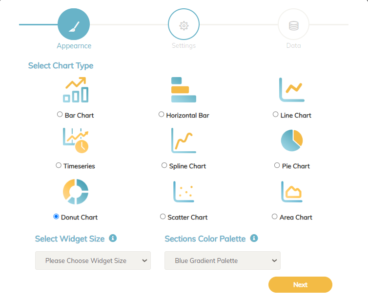
In this step, you will define the visual aspects of the chart:
- Select Chart Type:
- If your X-axis contains dates, choose a Timeseries chart.
- Choose a Color Palette:
- For Donut or Pie charts, select a color palette from the system’s multiple options.
- Set Widget Size:
- Choose between half-page width or full-page width to determine how the chart will appear on the dashboard.
2. Settings Page
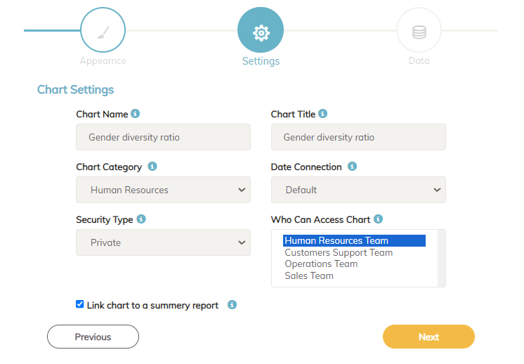
In this step, you’ll set up the key attributes of the chart:
- Chart Name:
- This is the name used when adding the chart to a dashboard.
- Chart Title:
- A title that appears on the chart, making it understandable for the end user.
- Category:
- Assign the chart to a category for easy filtering later.
- Data Connection:
- Select the connection from which the chart pulls data from your MySQL database.
- Security Type:
- Choose whether the chart will be Public or Private:
- Public Charts:
- Accessible to anyone, even without logging in.
- Can be embedded on web pages, allowing users to interact, export to PDF, or print.
- Private Charts:
- Restricted to admins and users with specific permissions.
- Supports drill-down features and detailed reports.
- Public Charts:
- Choose whether the chart will be Public or Private:
- Assign Groups for Private Charts:
- Select the user groups allowed to access the chart (multiple groups are supported).
- Link to a Summary Report:
- Choose whether the chart will be part of a summary report. This report combines both the chart and the underlying data.
- End users can view the summary report by clicking the three dots on the chart widget and selecting Display.
3. Data Step
In this step, you’ll define the data to be visualized in the chart, focusing on both X-axis and Y-axis configurations:
X-Axis Configuration
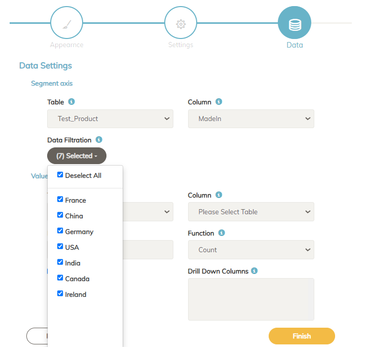
- Select Table and Column:
- Choose the table and the column that contains the X-axis data.
- Once a table is selected, all its columns will be available for selection.
- Handle Textual Data:
- If the selected column contains text data, the system will display all distinct values. You can deselect values you don’t want to display, giving you full control over what appears in the chart.
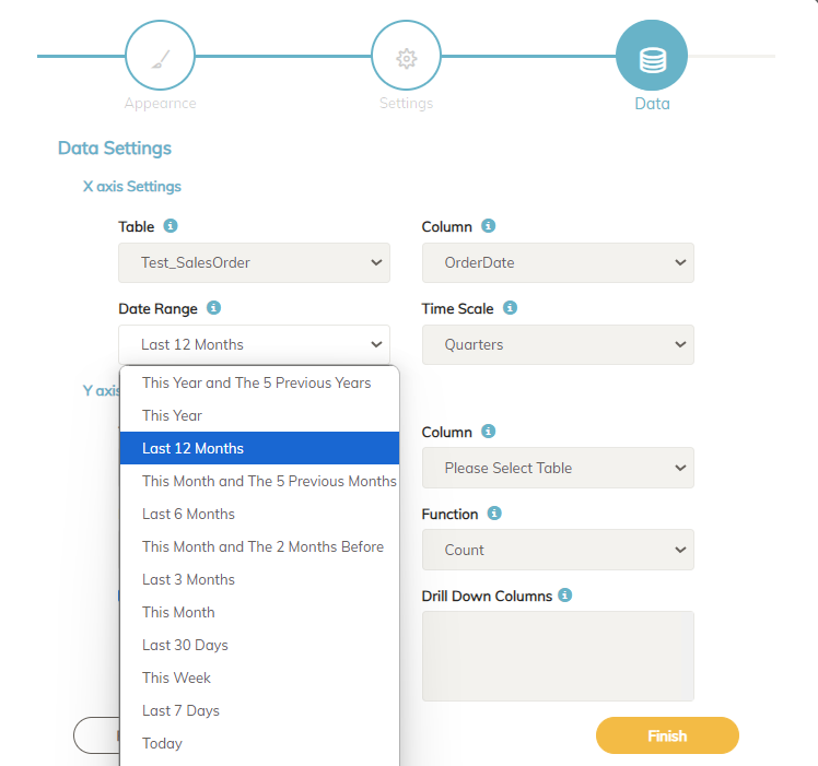
- Date or Timeseries Data:
- If the column contains date values, you can specify a date range (e.g., last 12 months, last 30 days, or this quarter).
- Additionally, select a time scale to group the data—for example, monthly or quarterly sales trends for the past year.
Y-Axis Configuration
- Select Table, Column, and Function:
- Choose the table and column that contains the Y-axis data.
- Select the function to apply, such as:
- Count on
Order_IDto get the number of orders. - Sum on
Total_Priceto calculate total sales.
- Count on
- Add a Label for the Y-Axis:
- For example, you can label it “Sales in USD” to clearly convey the metric displayed.
- Enable or Disable Drill-Down:
- Drill-down allows users to explore more detailed data by clicking specific sections of the chart.
- Select Columns for Drill-Down Reports:
- Choose the columns that will be displayed when users drill down into the chart.
What is Drill-Down and Why is it Important?
Drill-down functionality allows users to interactively explore deeper layers of data by clicking on specific sections of the chart (e.g., clicking on a bar to see the breakdown of sales by product category). This feature is critical for effective data analysis because:
- It provides detailed insights beyond the surface-level chart.
- Helps decision-makers identify trends, patterns, and anomalies quickly.
- Enables users to explore the underlying data without needing separate reports or dashboards.
Conclusion
Adding and editing charts using a Smart Report Maker is essential for efficient PHP data analysis. By following the step-by-step process outlined in this guide, you can create detailed and interactive charts that are easy to manage and insightful for your team. Whether you’re adding a new chart or refining an existing one, this system provides the flexibility and control needed to visualize your data effectively.
Make sure to utilize drill-down reports and configure chart settings thoughtfully to get the most out of your data. Empowering your team with these tools will enhance their ability to analyze trends and make informed decisions.


