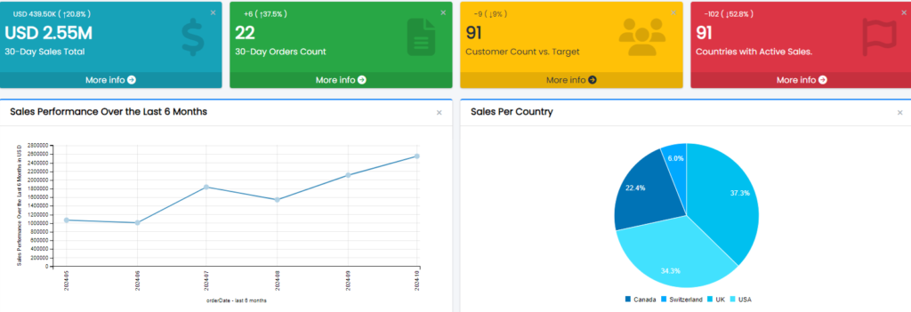
Creating and managing KPIs is essential for MySQL data analysis. This article provides a step-by-step guide to adding or editing KPIs in Smart Report Maker, leveraging data from your MySQL database. With this guide, you’ll learn how to effectively visualize and track performance metrics using the KPI Builder, which presents KPIs in formats like Info Box, Info Box with Icon, and Gauge Chart.

Adding a New KPI
Access the KPI Management Panel:
Click “KPIs / Metrics” from the side panel to open the KPI Management page.
Start the KPI Builder Wizard:
Clicking “Add New Metric” opens the KPI Builder Wizard, guiding you through the setup process.
Editing an Existing KPI
Locate the KPI:
Navigate to the KPI Management panel and find the KPI you wish to edit.
Edit the KPI:
Click the three dots next to the KPI and select Edit.
Permissions:
Only admins or the creator of the KPI (if they have a regular user role) can edit the KPI.
Step-by-Step KPI Builder Wizard
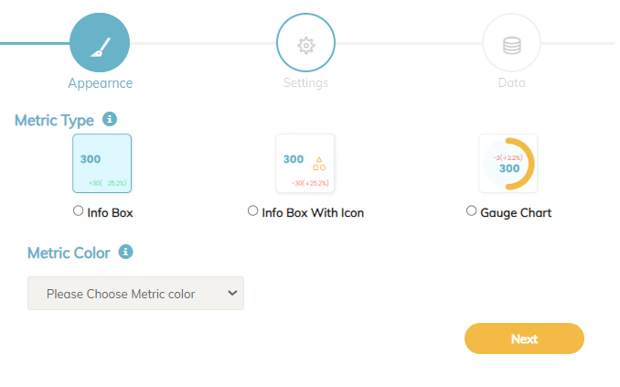
1. Appearance Step
In this step, you will set up the visual representation of the KPI.
- Select KPI Display Format:
- Info Box: A simple box to display the KPI. Choose a color to customize its appearance.
- Info Box with Icon: Adds an icon alongside the metric, providing more visual context. Here, you’ll choose both the box color and an icon from Font Awesome (FA) to represent the KPI.
- Gauge Chart: A dynamic chart type ideal for KPIs that involve comparison (e.g., showing progress toward a target as a percentage). This chart format is best suited when the KPI value is a percentage or when comparing a KPI with a target or historical value.
What is a Gauge Chart?
A gauge chart is a circular chart that visually represents a KPI’s progress toward a goal. It’s especially useful when a KPI is based on a percentage, such as the percentage of sales achieved toward a target. For example:
- KPI Represented as a Percentage: If a KPI tracks sales progress toward a monthly target, the gauge chart visually indicates how close the current sales are to the target.
- Comparison of KPI Against a Target or Historical Value: When the KPI compares a current metric with a target or historical figure, the gauge chart offers a clear way to display progress.
Note: If no comparison is chosen for a KPI displayed as a gauge chart, the system will prompt with an error:
“Given that the metric type is a ‘gauge chart,’ you need to choose a comparison option to establish a target for your chart.”2. Settings Page
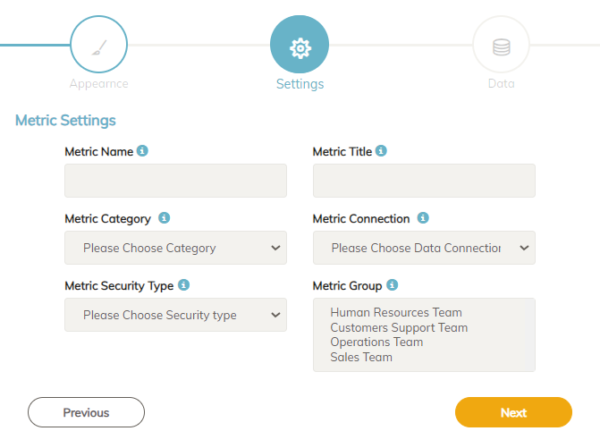
On this page, you’ll define key attributes for your KPI.
- KPI Name: This name serves as a reference for adding the KPI to dashboards or the homepage.
- KPI Title: A descriptive title which will appear on the KPI widget.
- Category: Organize the KPI under a specific category to make filtering easier.
- Data Connection: Select the MySQL database connection that the KPI will use.
- Security Type:
- Public KPIs: Accessible to anyone without login, ideal for embedding on web pages where users can view and interact with the KPI.
- Private KPIs: Restricted to admins and users with specific permissions, allowing for internal analysis.
- Assign Groups for Private KPIs: Specify user groups allowed to view the KPI, supporting multiple groups if necessary.
3. Data Step
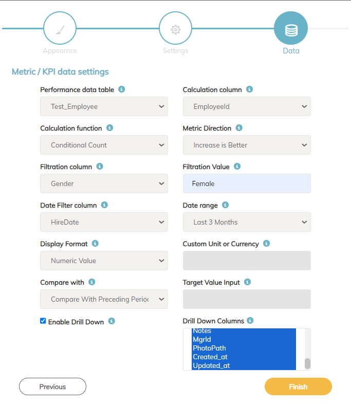
In this step, users will select the Performance Table and Calculation Column to define the metric data source.
- Performance Table: Choose the database table that contains the data you want to analyze. For instance, if you want to count orders, the performance table would be the Orders Table.
- Calculation Column: Select the specific column for your metric calculation. For example:
- To count orders, use the OrderID column in the Orders Table.
- To get the maximum salary, select the salary column in the Employees Table.
Calculation Functions
In KPI management, various calculation methods provide insights into data trends and performance metrics, tailored for effective PHP data analysis. Each method allows users to apply specific functions, and with conditional functions, users can add filters for more precise insights. Here’s a summary of each calculation method:
- Count Distinct: Counts unique values, so repeated values are counted only once.
- Count All: Counts all values, including duplicates.
- Conditional Count: Counts values based on a condition, e.g., counting female employees.
- Sum: Totals values in a column, like summing sales.
- Conditional Sum: Sums values based on a condition, e.g., summing sales in a region.
- Average: Calculates the average of values.
- Conditional Average: Averages values based on a condition.
- Max: Finds the highest value in a column.
- Conditional Max: Finds the highest value with a condition.
- Min: Finds the lowest value in a column.
- Conditional Min: Finds the lowest value with a condition.
- Sample Standard Deviation: Measures sample data dispersion.
- Population Standard Deviation: Measures data spread across an entire dataset.
These methods support in-depth data analysis, with conditional functions allowing for specific data segmentation and insight. Conditional methods enable users to filter data based on specific criteria, making it easier to analyze particular segments of data, like gender-based workforce analysis.
Metric Direction:
Users can select Increase is Better or Decrease is Better to define performance context:
- Increase is Better: Suitable for metrics where growth is positive, like counting orders.
- Decrease is Better: Suitable for metrics where lower values are preferable, like counting refunds.
Filtering Options for Conditional Calculations:
If you select a conditional function, you’ll need to specify:
- Filter Column: The column for filtering data. For example, to count female employees, use gender as the filter column.
- Filter Value: The filter criteria, like setting the gender filter to “Female” for female employees
Practical Examples of Filter Column Usage
The Filter Column along with the Conditional calculation functions is used to refine data based on specific criteria, allowing a more targeted analysis of KPIs. Here are examples:
- Counting Female Employees: Use the
gendercolumn as the filter column and set the filter value to “Female” to track the total female workforce. - Product Category Sales: Use the
categorycolumn as the filter column and set the filter value to “Electronics” to monitor sales specifically within the electronics category.
Date Filter Column:
Select a date column to filter data by time, useful for time-based comparisons. For example:
- To view new hires in the last three months, use HireDate as the date filter column.
- To analyze recent sales, set OrderDate with a 30-day range.
Display Format:
Choose how the KPI value will appear. SRM supports the following formats:
- Numeric Value: Displays the calculation result without formatting.
- Compact Currency Format: Adds “K,” “M,” or “B” for thousands, millions, or billions. Enter the currency in the “Custom unit or currency” box.
- Standard Currency Format: Displays results in traditional monetary format with commas.
- Custom Unit: Adds a unit for measured values like temperature or weight (e.g., “kg”).
- Percentage: Presents the KPI as a percentage, useful for percentage-based metrics.
- Percentage of Total: Used with conditional functions to show metrics like the percentage of female employees or refunded orders relative to totals.
Compare With:
Choose a comparison option to track KPI trends:
- Preceding Period: Compares with the previous period, like last month.
- Same Time Last Year: Compares with the same period in the previous year.
- Fixed Target: Compares with a specific target value, which can be defined in the Target Value input.
Drill-Down Option:
Enable Drill-Down to allow users to click the KPI and view a detailed breakdown in a report. You can select which columns appear in the drill-down report, which can then be exported or printed.
Conclusion
Smart Report Maker’s KPI Builder offers powerful tools for MySQL data analysis, allowing users to create and manage KPIs with ease. With flexible display options such as Info Boxes, Info Boxes with Icons, and Gauge Charts, and robust filtering and comparison capabilities, Smart Report Maker ensures that KPIs are visually impactful and provide clear insights into performance metrics. Whether monitoring simple metrics or evaluating complex comparisons, Smart Report Maker makes it easy to track progress and support data-driven decision-making.


